Is this what forever looks like?
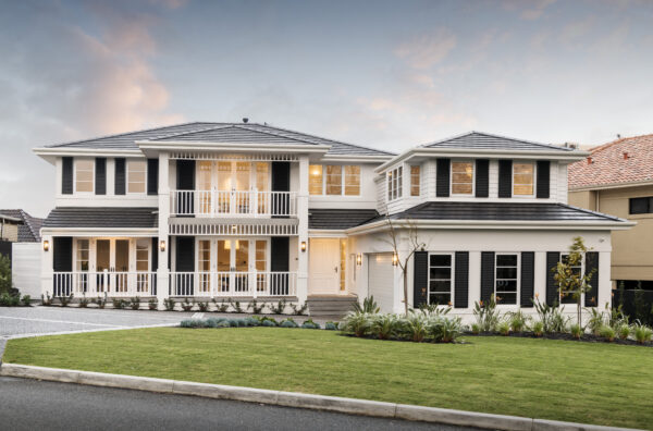
Coastal Home Design: The Whitsunday. A stunning showcase of ‘barefoot luxury’ that’s got visitors hankering after storm shutters, white-washed walls and lush Plantation-inspired greenery, all set in a tropical paradise.
It’s a custom home, which means it was designed down to the last millimeter to be a perfect match for both the family who commissioned it and their Applecross block.
It’s also a big house and there’s a lot to talk about, so we’ve broken it down into bite-sized chunks as we run through the details that make the Whitsunday such a standout.
The brief: In a nutshell, the clients wanted a large home that could easily accommodate a family of five, as well as regular overseas visitors.
The site: An old house was demolished to create a site of 1,211sqm that although large, had some pretty challenging dimensions. More than 23m wide at the front, it was 79m long, tapering along its southern boundary to just 8m at the back. To make things even trickier, this wedged-shaped block sloped from front to back. The challenge, says Design Manager Brook Leber, was to design a home that didn’t feel “hemmed in” or narrow at any point, while also accommodating the change in levels. “Where some people see challenges, we see opportunities,” Brook says.
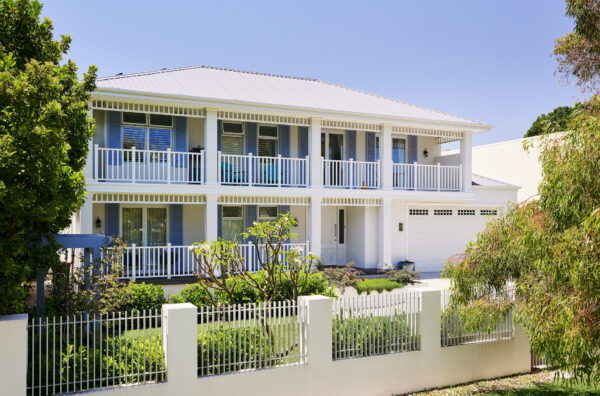
The custom solution: Brook gave the two-storey house an intelligent L-shaped footprint and a double garage with side entry. This freed up maximum width at the front to design a rectangular-shaped house with an impressive ‘Colonial-inspired’ elevation. The southern side of the house was tapered to hug the angled contour of the block, while the ‘squarer’ northern side opened up to catch winter sunshine and the abundance of natural light that filters throughout the home.
The inspiration: The clients love the feel of the British Colonial style associated with iconic buildings such as the Raffles Hotel in Singapore, which first opened its doors in 1887. Designed to provide a cool haven away from the unrelenting sunshine of the tropics, the Colonial homes were early examples of passive solar design, with shady spaces designed to offer respite from the searing heat, and windows thoughtfully positioned to catch cooling breezes.
The style: The clients’ vision and our Coastal Plantation style were a match made in heaven. We refer to the style as ‘barefoot luxury’ because it’s casual, comfortable and unpretentious, yet still elegant and graceful, with a touch of beachside luxury in Hawaii and the Caribbean. It’s also a timeless style and one that slips straight into established Perth streetscapes along the river and the coast.
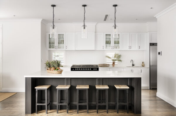
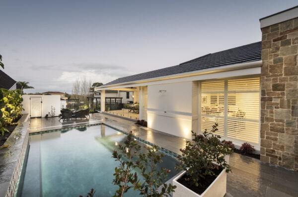
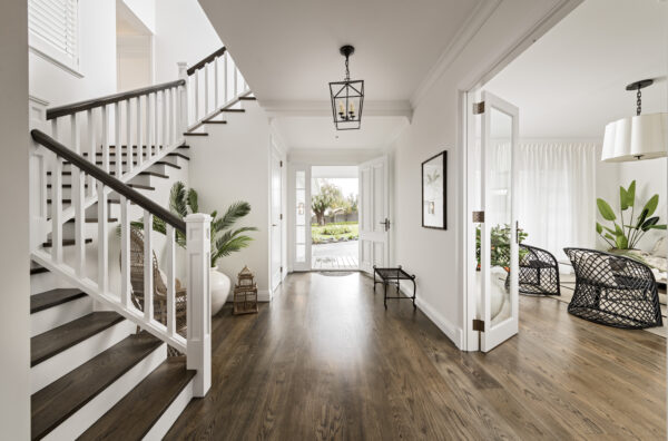
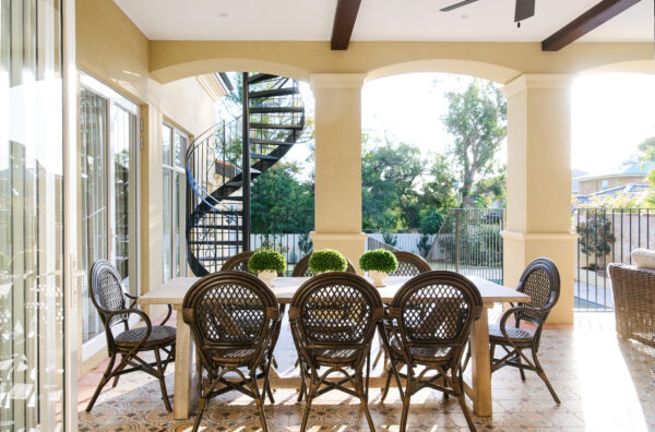
The floor plan: To meet the brief for a large home for a family of five and regular overseas guests, Brook designed a free-flowing floorplan delivering a whopping 650sqm of home. There are five bedrooms, three bathrooms, two powder rooms, a grand entry hallway, and both formal and informal living areas, including a huge kitchen and scullery, lounge, boot room, alfresco, kids’ activity room, dedicated guest suite, and a den and separate study opening up to the sweeping front verandah. By adding steps at the midway point on the ground floor, Brook not only accommodated the sloping block but also created a definition between the formal and informal areas of the house. The luxurious master suite is on the ground floor and the kids’ and guest rooms are on the first floor, providing the zoning that the clients were looking for. Also on the clients’ list of priorities was a chef-worthy kitchen and scullery, and a luxurious master suite with opulent bathroom looking out to ponds and gardens.
The elevation: Defined by its black-painted storm shutters, crisp white walls, sweeping verandah and low-pitched shingle-style roof, the front façade evokes the elegance and charm of the old Colonial homes. The white-painted balustrade and frieze are classic and unfussy, while the weatherboards add simple texture and detail.
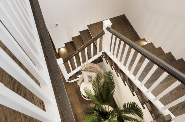
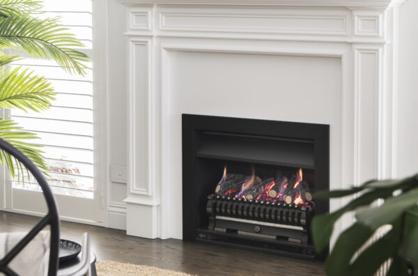
The interiors: High ceilings throughout accentuate what are already impressive spaces, while the raking ceiling running the length of the main living area and lounge takes the height and volume up yet another notch. Hardwood floors, textural neutrals, a dash of pattern here and a splash of colour there, ebony-black accessories and accent pieces; they’re all set off by lots of lush, fresh greenery against white-painted walls. The overall effect is tranquil, sophisticated and very, very welcoming.
The forever after: Both traditional and modern, the Whitsunday has been designed for the long haul. The integrated guest suite not only makes it easy to welcome guests, but it also means several generations could easily be accommodated under the one room in the long term. The sheer size of the house guarantees the family will never outgrow it and the fully resolved custom design ensures that nothing has been overlooked. “Custom design may cost more, but it offers better value in the long-run,” Brook says. “That could be because you’ve got a more liveable home, a lighter, brighter and airier home, or a home with reduced running costs or better long-term flexibility, for example. Custom design means you can look past the obvious and design something that truly works on all levels.”
See more of our editions.


